URBAN YOGA SPA
DURATION: 2 week sprint
ROLE: Sole Designer
TOOLS: Pen & paper, Omnigraffle, Sketch, InVision, a massive amount of Zen
DELIVERABLES: Contextual inquiry and persona validation findings, context scenario, competitive analysis, wireframes, usability test findings, hi fidelity mockups
NOTE: This is a concept redesign for a responsive website
SUMMARY
ABOUT: Urban Yoga Spa is an independently owned and operated yoga studio, spa, and coffeehouse in downtown Seattle, Washington.
CHALLENGE: Urban Yoga Spa's responsive website has issues with visual hierarchy and their checkout flow. The site showcases three different businesses, causing user confusion when attempting to view and purchasing yoga classes and spa services. One major challenge is reorganizing the site to allow users to accomplish their tasks easily based on assumptions of business needs and goals.
OUTCOME: A simplified navigation, updated layout style, and fully integrated checkout flow.
LESSONS LEARNED: Rely on the research when ideating to make the design process go more smoothly.
PROCESS
Discovery
CURRENT SITE
This is Urban Yoga Spa's current site home page.
CONTEXTUAL INQUIRY
To verify this persona and identify the site pain points, I conducted a contextual inquiry with three people that fall into this persona.
They completed the following tasks:
Finding the class schedule
Making a purchase
Finding a spa service
PAIN POINTS
Three main pain points were identified:
Confusing and unorganized navigation to the the class schedule and options
Redirection to the third party site Mindbody to complete purchases with no easy return to the site causes user frustration (pictured left)
This is a desktop site, not a mobile application preferred by the persona (see below)
PERSONA VALIDATION
I was provided with the persona, Laura Davis, to help guide my redesign.

Laura Davis, 29
A script writer that is a technology native and prefers mobile platforms over desktop.
She likes to try new things and values exclusivity and authenticity.
She looks for pleasing pictures of products and services and enjoys writing reviews of her experiences.
She is a regular social media user.
COMPETITIVE ANALYSIS
To guide the redesign, I conducted a competitive analysis of similar boutique studios including Soul Cycle, Core Power Yoga, and Orange Theory.
I wanted to determine what were the most popular tools for users on these sites and how Urban Yoga Spa compared.
Urban Yoga Spa is only hurting in its organization.
DEFINE
Based on the persona needs and research, I was able to define the problem and offer a solution.
THE SOLUTION
By reorganizing and streamlining the site structure, users will be able to find necessary information and purchase services with ease.
THE PROBLEM
Users need to be able to find information and pay for services online effortlessly.
DESIGN
CARD SORT
To address the information architecture issues, I conducted a card sort with five users. They sorted, labelled, and ranked the importance of each category.
FINDINGS
All users ranked the yoga services as most important, with spa services coming second.
Urban Yoga Spa also has a coffee house that all users reported confused by its inclusion in the main navigation.
PAPER PROTOTYPES
I started ideating with paper sketches.
I tested each version I sketched, refining my designs based on user feedback with each iteration.
None of my initial designs tested well, user reporting the structure did still not have intuitive wayfinding.
FINAL PAPER ITERATION
My final paper iteration was greatly simplified, but was still not testing well with users. Each of the three users questioned why all three businesses were featured on the home page when they were expecting the site to highlight the yoga services.
Shown are the home, schedule, and pricing pages.
WIREFRAMES
I developed wireframes based on the feedback from my paper prototype tests and the persona needs.
KEY SCREENS
HOME PAGE
Now features the yoga services with easy access to the spa services. The coffeehouse information is still present, but moved to the footer.
SCHEDULE PAGE
The design is dictated by the third party software Mindbody. The page layout is simplified with navigation tabs to switch schedules and days.
PRICING PAGE
Displays easy to scan class packages with the ability to access in depth descriptions and pricing with a popup through Mindbody.
CHECKOUT FLOW
The new checkout flow no longer redirects users to a separate page. Instead, it displays as a popup. The Mindbody integration has the ability to display in this way.
This format allows users to remain on the Urban Yoga Spa page as well as receive a thank you and a message to expect more information about their purchase in their email, building trust with the user.
TESTING
I usability tested the task scenarios and wireframes with three users to collect feedback.
WHAT COULD BE BETTER:
Sign in process (not pictured)
Placement of reviews and social media
Pricing labels
WHAT WENT WELL
Clean layout with plenty of white space
Easy navigation
Clear labels
Concise checkout
HIGH FIDELITY MOCKUP
Based on the wireframe feedback, I developed a high fidelity mockup of the new home page.
It showcases the yoga services and reviews, but includes easy access to the spa and the coffeehouse information.
The large, colorful pictures and reviews will grab our persona's and capture her as a customer, despite being a desktop site.
NEXT STEPS
I will continue usability testing the current frames and flows, iterate on feedback, and develop more high fidelity mockups.
LESSONS LEARNED
USER RESEARCH
Relying on research allows the design to meet user needs and can lead you in the right direction when stumped.
VERIFY PERSONAS
When provided a persona, verify it with users in that demographic to ensure designs solve the problem that demographic has.
THIRD PARTY APPS
When integrating third party apps, be sure they can be fully incorporated into the site to make checkout flows seamless for users.
OTHER WORK

iSpot.tv
Data Analytics Dashboard
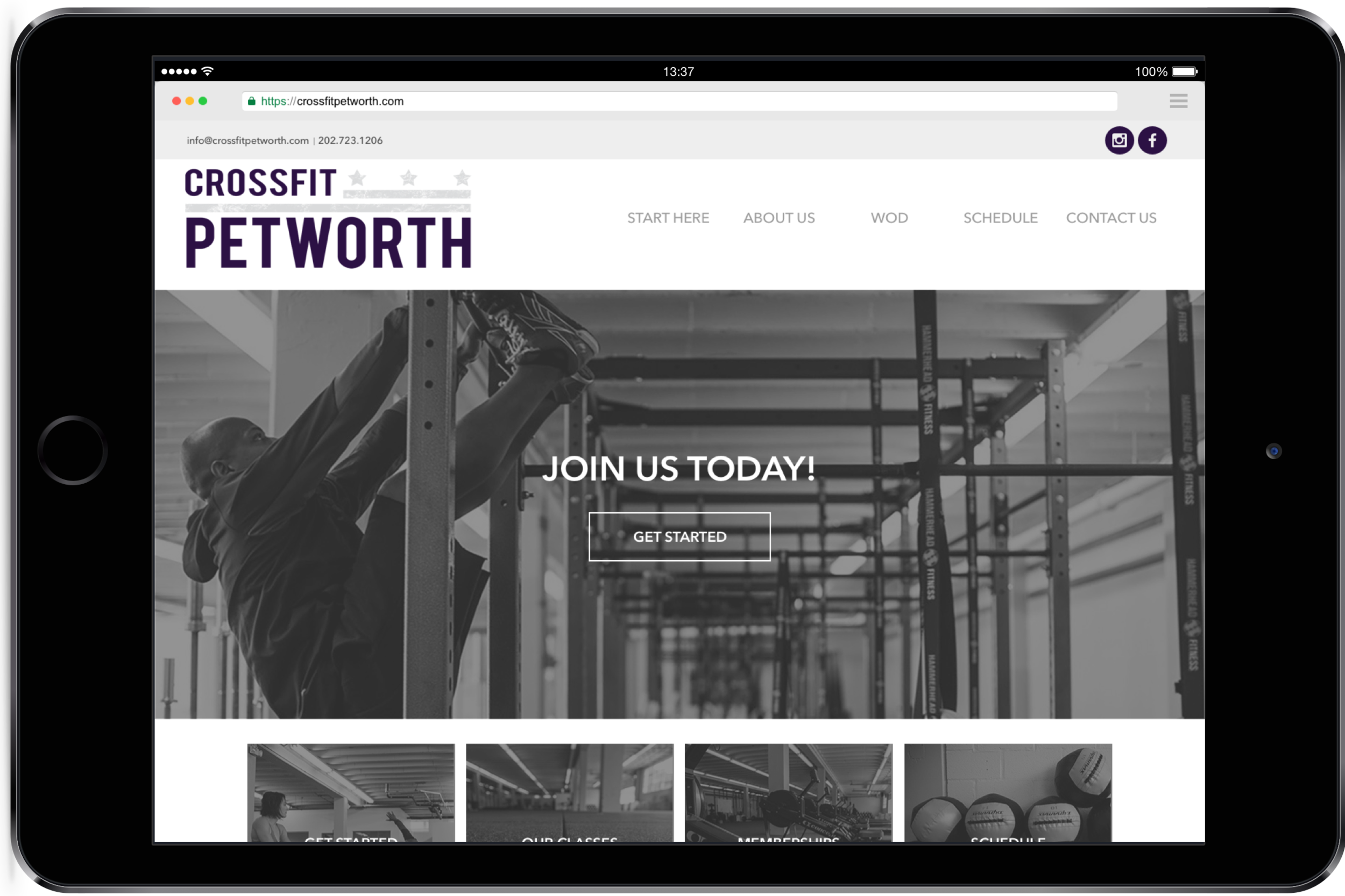
Petworth Fitness
Responsive Website
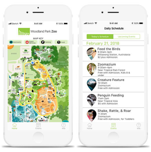
Woodland Park Zoo
Concept iOS App